Friday, January 30, 2009

For all of you "green" types


My Mom was a depression child and was into recycling before there was such a word. I used to think a lot of it was silly since I was part of the "replace" generation. As I got older I thought about my impact on the environment and what I can do to recycle. We participate in curbside recycling and I try to buy products that can be recycled or reused. I participated in a swap recently where recycled products was one of the main points. I used recycled cereal (or similar weight) boxes.


I ran across a technique in the September 08 issue of Scrap & Stamp Arts. The author had come up with a great way to soften a stamped image by overlaying a used dryer sheet. I tried it and was happy with the results. I used a card/envelope from the bargain bin of Michael's that came in a pack. On top of that I stamped some postal images from Limited Edition. The main image, the globe is from Stampabilities. The sentiment is from Inque. Hope you like it.
Until my next post,
Diane

Thursday, January 29, 2009

Penny Spinner Cards


I like going to a Rubber Stamp Show/Convention when I can. I’m lucky enough to have one VERY close to where I live. About 8 of the vendors own the promotion company so they travel to all of the shows. The rest of the vendors come from various locations to supplement with their specific type of crafty items. I’ve been taking classes at these shows. I haven’t learned anything that I probably couldn’t do on my own BUT I get a finished product with instructions and can then adapt it to my supplies. I learned how to make these spinner cards at a class and thought it would be a great card to give to a kid. Basically you put two pennies together with a foam pop dot and insert it in a slit that is elevated with foam squares. On top of the penny you put something like the circus animal or cowgirl and when you tilt the card that item goes around in a circle. If you google spinner card you’ll come up with picture and video tutorials to help you if you want to make one. For these cards I used a paper from the Kazoo Kids collection by K&Co.

Until my next post,
Diane

Wednesday, January 28, 2009

Scanning

I'm pretty good at remembering to scan every ATC and card I make. I name them by the recipient and then the reason. For the card I made yesterday I named it "MomThinkingOfYouJan09". I keep the cards in one folder and the ATC's in another and my mini books in a third. I'm a bit type "A" about my organization but I have to say that I rarely can't find something. I take photos of the larger projects that can't fit on the flatbed scanner. The scanning produces a decent photo but the color is off. I have the luxury of having the full version of Photoshop so I make my adjustments using that software. I compare the scan to the original and usually adjust the image by going to "Image-adjustments-color balance". I know every monitor is different but if it looks good on mine that's the best I can do and hope I've captured a good image for all of you out there. I save my images as a .jpg unless I'm doing layered Photoshop work then I save it as a .psd which is a Photoshop document. My camera doesn't shoot in the .raw mode so those images are saved as a .jpg as well unless doing serious Photoshop work. I do reduce the file size of my camera work since you all don't need to see a 5 megapixel photo. If you have some sort of image processing software play with the settings a bit and you'll probably be happy with the results you can come up with. It is just digits and if you don't like what you do don't save the changes. Until my next post, Diane

Tuesday, January 27, 2009

Thinking of....Mom


This card was modified from the November 2007 SheetLoad pattern. I had bought a "super slab" package of paper from Provo Craft and put some patterned papers together following the SheetLoad diagram. I did some inking on the edges of the solid card stock and layered it all on a blank card that I got from the bargain bin at Michael's. I added a bit of ric rac as an embellishment. The stamp is one of my MANY Studio G $1 stamps. I have to say that I buy a lot of these but I use a lot of these too. They are nice and small to use for cards like these. I think Mom will like the card...hope you do too.


Until my next post,

Diane

Monday, January 26, 2009

Stamers Corner Bling, Bling ATC


This was the last ATC I did for my January ATC swaps with Stampers Corner. We are transitioning to a new format. Instead of making four of the same ATC’s you will make one and have a partner. This might help on mailing costs and encourage more folks to play. I hope it works. I like the swaps since it makes me “just do it”. If I have a deadline and a project I tend to get more stuff done. The theme for this ATC was called "Bling, Bling". Mine is kind of Bling, bling, bling, bling, bling.... I guess I got a little carried away with the bling. This one has a base paper layer colored with Tsukineko Brilliance Pearlescent Purple overlaid with a DCWV metallic paper that I put through my Cuttlebug using an embossing folder. On top of that are two purple bling flowers. I took the big chipboard flower and painted it with Ranger Distress Crackle Brushed Pewter. After it dried I colored it with alcohol inks. I used the same colors (Wild Plum, Raisin) on the dragonfly and the clear Heidi Swap ghost flower. I didn’t get as much deep crackle effect as I had hoped. I guess I’ll have to layer the paint a bit thicker next time. Hope you like it.

Until my next post,
Diane

Sunday, January 25, 2009

Pages for Mixed Media Art Friends group


I signed up for another technique swap a while back. This is the first swap I've done with the Mixed Media Art Friends Yahoo group. This swap has 22 participants and if I may quote from the group our technique can be anything of our choosing: fabric, screen printing, felting, paper, backgrounds, acrylic, watercolor, metal, polymer clay, jewelry, wire, beads, sequins, plastic, charms,etc...
I went with my recycled boxes again but instead of the gesso and oil pastels I had an entirely different technique on top. I wish I had saved my reference link but I didn't so I can't give credit to the person I first saw do this. They used grunge board (I used the box) as a background. Take an old dictionary page and adhere it to your base surface with Mod Podge (I used Liquitex Matte Medium). You need an adhesive that will dry clear. Apply another layer of your adhesive on top of the dictionary page. When it is dry trim the dictionary page to the proper size. Using the Ranger cut-n-dry foam and Distress Inks apply the lightest color to the paper. Run the cardboard through a Cuttlebug or similar embossing machine. The final step is to apply the darker color ink using the direct to paper method. Hope you like it -- I'll be sending my pages to the hostess tomorrow.
Until my next post,
Diane

Saturday, January 24, 2009

Stampers Corner Pink on Pink ATC


Here’s another ATC I did for a January swap with the Stampers Corner Yahoo group. This one has card stock as the background then glossy paper from the Paper Cut. I took the glossy paper and used my Crayola color explosion spinner. As the glossy paper was spinning I sprayed it with pink liquid watercolor from Discount School Supply and dropped a bit of Seashell Pink ranker from Ranger. After it dried I stamped it with a homemade stamp using Tsukineko Brilliance Pearlescent Orchid ink. On top is a “P” that is colored with Ranger Worn Lipstick crackle paint. I used the same color Distress Ink on top with cut-n-dry foam. I spelled out the rest of the word pink with $1 Studio G stamps and inked it with Color Box Chalk Warm Red ink and covered it with Kundy Glitz Pink glitter glue. The last step is adding a bit of punchinella from SkyBluePink. Hope you like it.

Until my next post,
Diane

Friday, January 23, 2009

Stampers Corner We Are In Love ATC


These are ATC’s I made for my Stampers Corner Yahoo group. One of the themes this month was “We are in love”. I took some cardstock and layered a semi-glossy cardstock that I had colored with Ranger Distress inks using Ranger cut-n-dry foam. On top of that I used a free image from Digital Collage Sheets. My embellishments consist of Heidi Swap ghost hearts colored with Ranger Alcohol Inks, used postage stamps (only had 3 of the love so I had to use a different one for the fourth ATC) and a clear bling heart from “me & my BIG ideas”. Hope you like it.

Until my next post,
Diane

Thursday, January 22, 2009

One piece of paper -- Design II second book


Here’s the second book I did for my Design II class. Our instructor, Peter Giscombe, said this was a problem solving class and it was. We kept a journal through the semester to write down ideas, web links and our thoughts. At the beginning of the semester he said there would be a point in the class where we’d probably want to curse him out. I hadn’t reached that point (yet) and was having a great time. I really liked the section where we made books. I made this one using one piece of paper. That was the challenge to myself through a good part of the semester – what can I do with one piece of paper. I used watercolor paper for this book and got the coloring with walnut ink. I then used a bunch of collage rubber stamps, many from Inque to decorate it. I used salt in some places on the wet paper and also some dry walnut ink crystals to get various effects. I liked this one and made another for Peter to show other student. He got the projects I didn’t feel like keeping. Hope you like it.

Until my next post,
Diane

Wednesday, January 21, 2009

Stampers Corner Jan ATC Lottery

This is the ATC I did for the January Stampers Corner ATC lottery. The winner of the previous month picks the next months theme. This month the theme is Celestial. Everyone does their ATC and submits it to the online group photo album. At the end of the month the previous months winner then draws a random number as the winner and everyone sends their creation to the winner. I won in August and got a bunch of Hunka Hunka Burnin Loves (translation: Elvis ATCs). I don't play every month but do submit quite often since I started. It all depends on if I have something to fit the theme. Although my husband thinks I have every stamp known to man there are a few themes I don't have anything for.

This ATC was made by masking and embossing a few Astrology stamps by Inque and then filling in the background with Ranger Distress Inks. I sprayed some gold paper with Ritzy Ditzy Glitz gold spray and layered that on purple DCWV paper.

Until my next post,
Diane

Tuesday, January 20, 2009

It's almost like a quilt


I mentioned before that I'm a member of a bunch of Yahoo groups devoted to paper crafts and bookmaking. I'm participating in a swap with Art Techniques a mixed media group. The 2009 Technique Fat Book has 120 participants all doing different techniques. Our theme for this swap is homemade, cheap or recycled materials. I'm doing the technique I featured in a previous post mimicking what Lori Roberts did on recycled cereal or similar weight cardboard with water soluble oil pastels. I made 130 instead of 120 because we had 125 participants originally and some folks dropped out. As I was laying all of these pages on the floor to take the photo it reminded me of a quilt. These are going in the mail very soon to the hostess and I can't wait to see what I get in return.
Hope you like my technique. Until my next post,
Diane

Monday, January 19, 2009

Where I've been

This blogger thing is great. I've been posting now for 10 days and I've been gone. That's right, I've been goofing off on the ski slopes of Sugarloaf USA in Carabassett Valley Maine. For the 5 years or so hubby and I have been joining a group of folks and making the trek up to Maine. We stop in Connecticut to visit family and then join the group. We get a great group deal with condo accommodations, a welcome party Monday evening with a free drink and door prizes, lessons if you want them, a five day lift ticket and access to their fitness center with pool and hot tubs.

The picture I've attached is the wire sculpture I did for my Design II class. I used a package of door shims and painted them white to give the sculpture a little more appearance of movement. It is a bit out of proportion, skis have gotten shorter in the last decade but not THAT short. You get the point though it is a skier. This is sort of like my Scream sculpture -- a bit off but I still like it -- I must have since I kept it.

Until my next post,
Diane

Sunday, January 18, 2009

Thank ya, thank ya very much


This is a thank you card a created a while back. The sentiment inside is the classic Elvis phrase "thank ya, thank ya very much". The paper is from EK Success and the stamp is from Stampsmith.
I have some more of this paper and of course I have this stamp so my reminder from a few days still holds, if you get something like this someday just act surprised like you've never seen it before.
Until my next post,
Diane

Saturday, January 17, 2009

Design II Plaster of Paris Sculpture


Some of you might not consider Plaster of Paris as a sculpture medium. At the community college level in a Design II class where you are trying to cram in a bunch of techniques into a 15 week semester Plaster of Paris was our sculpture medium. We used milk cartons as our mold; poured the plaster in and let it sit. It sets quick and is pretty easy to carve/cut. The theme was open and I tried a 3D version of Edvard Munch’s Scream. The original is now back in place at the museum of his name and being restored. I think when you see my piece you recognize that it is a representation of the painting which is good. As a sculpture piece it is OK. Maybe not my best work but I did keep it which says something.

Until my next post,
Diane

Friday, January 16, 2009

Design II My first book


Design II was another of the required Fine Arts courses in my computer arts program. I was excited when I reviewed the syllabus and saw we were going to make art books. We got a demo from Peter our instructor on the various zig zag or concertina style books. We were supposed to use canvas or other cloth to cover the book as opposed to paper. The book was supposed to be decorated and not left blank to use as a journal or a scrapbook. I went with an Asian theme. I used Bienfang watercolor paper and I used my spray watercolors again. After that was dry I added some stamping, stenciling and embellishments. I used embossing powder on the cover and then added some coins from SkyBluePink.
Until my next post,
Diane

Thursday, January 15, 2009

Last months swap with Sid


I already showed you the King Tut/Egyptian ATC a few days ago that I sent to Sid on my monthly swap. Here are the other two ATC's from that ethnic/cultural theme. The first is Greek - the stamps are from Non Sequitur. I made the Apollo with lots of layers of silver embossing powder. The last time when you are ready to stamp just make sure your stamp has some releasing agent so it doesn't get stuck. I used VersaMark. It gives your stamping a neat faux metal look. The last ATC has an Asian theme. The stamps are from Stampsmith. I got the charms from SkyBluePink.
Until my next post,
Diane

Wednesday, January 14, 2009

Stampers Corner December ATC's


These two ATC's were done for my Stampers Corner Yahoo group December swap. The first one had a theme of silver and either purple, blue, green or red. I embossed with a Cuttlebug on the silver insulation tape from a home improvement store. I colored it with Ranger Stream, Denim and Stonewash alcohol inks. I added the German scrap sun in silver and a few bling rhinestones. The second one has an arctic theme. The stamps are from Delta. I made a mini shaker snowglobe but using ice/snow colored glitter after coloring the bear with Sakura glaze markers. The snow stamps are the Studio G $1 stamps. The white paper is from the Paper Cut.
Until my next post,
Diane

Tuesday, January 13, 2009

Stampers Corner ATC of the Month Jan 09


This is an ATC I did for the Stampers Corner Yahoo group. I recently signed up for the ATC of the month swap on a permanent basis. Along with monthly swaps where we make four ATC’s and get four different ones back this swap is make one and get one. The partner list rotates monthly so you aren’t always swapping with the same person. The theme list is posted a year ahead so if the muse visits you can get a bunch done ahead and then just wait until you find out who your partner is. For this swap the theme was time/travel. I used Inque stamps and made the one that looks like a watch face by stamping on chipboard and then coating it with glossy accents. Let that stuff dry overnight and you’ll love the results. I hope my recipient likes it.

Until my next post,
Diane

Monday, January 12, 2009

Tim Holtz stamp ATC swap


I belong to a bunch of Yahoo groups. In many of them I just lurk - not sure why. I'm pretty active in one, I do ATC swaps on a monthly basis. I've got something going on in two others and I'll show you that later. This ATC was for the Creativeblock-Stampers Anonymous group. All we had to do is make 6 ATCs using any Tim Holtz stamp. In return we get 5 back. One ATC from every participant goes to Ted one of the owners of the company. He's the guy you are likely to see at stamping shows around the country doing demos of all the great techniques you've heard about using Tim's stamps and many Ranger products. I used the Blackbird Collage stamp. I inked portions with different chalk inks. I stamped the birds again and embossed with black embossing powder and cut them out. I added some watch parts and then covered some small chipboard pieces with silver aluminum insulation tape (you can find great crafting supplies in hardware stores) and used metal embossing letters to spell out CROW.
Until my next post,
Diane

Sunday, January 11, 2009

Batch cards


Some people might think this is "wrong" but I sometimes make cards in batches. I have used ideas from Sheetload a few times and I'll tell you what - you can crank out a bunch of cards (all the same and all a bit different too) in a short time. I use their design and modify it a bit to suit my paper and embellishments. The card base is simple bulk card stock (8 11/2 x 11 cut in half and scored to get two A2 size cards). Three have the plum background card stock from DCWV while the remaining papers are from American Traditional Designs. The sentiments on the front are stamped by Cloud 9 Design or Impression Obsession. I used two fun tools to make these cards. The first is my Cuttlebug with the Spellbinder scalloped square die. The second tool is the Paper Gator to round the corners of the smaller paper. It makes great cuts on multiple sheets of paper and many other things. By the way if you happen to get one of these cards act surprised like you've never seen it before!

Until my next post,
Diane

Saturday, January 10, 2009

Design I Color Wheel


This was fun…mixing and learning about color. I mentioned in a previous post that we only had two yellows, two reds, one blue, one violet and one green plus black and white colors of gouache. The inner wheel the one shaped like a pie is has the colors above (minus black and white) out of the tube then mixed to make the colors in between. Next we have tints (white added), shades (black added) and tertiary colors. It was fun to mix all these and know that you can make a lot of different colors with just a few tubes of paint.

Until next time,
Diane

Friday, January 9, 2009

Design I Collage

For this project we had to incorporate these two bottles into a collage. How you displayed these bottles was your choice. We used magazines to create the collage. I decided to make a beach scene sort of a message in a bottle type thing. The only piece of paper I altered is the one I rubber stamped some scribbled writing on. You could cut or rip your paper into pieces. We had to use either complementary colors or colors that are adjacent on the color wheel. I went with the purples and yellows (complementary). Play a little “Where’s Waldo") and look for two bottle shapes and three seagulls imbedded within the collage.

Until next time,
Diane

Thursday, January 8, 2009

May I introduce you to BC (and KC)


I thought you needed a break from my artwork so as promised in my first post here are some photos of the cat(s). On the left atop the heater vent is my buddy BC. He entered our home on Superbowl Sunday 2003 at the age of about 6 months. I brought him and his sister KC (she died of FIP in May 2003) into the bathroom when we got home. I read where a small sized environment can help make the transition easier (yeah right). We stayed in there for over an hour. As soon as I opened the door they ran out made an immediate left turn and ran behind the washer/dryer and stayed there for a while. I finally coaxed them out and then she ran and hid UNDER the Lazy Box chair in the office. BC joined me for part of the game but KC was still scared. The next day she decided to join me as I used the computer. It was very sad when she died, she was getting more comfortable around strangers and was a great companion for BC.
Until my next post,
Diane

Wednesday, January 7, 2009

Design I black and white


This was an assignment in how to make an ordinary simple object look interesting through repetition. The object I chose was a simple clip that you can get at any office supply store. Draw the object in a few different views and pick the one you like. Next turn it 90 degrees and keep doing that until you get an interesting pattern. It is a poor mans way to try to imitate M.C. Escher but without the wonderful dissolves and illusions he did. This was painted in black gouache with the edges in Prismacolor marker for more precise work. As I was painting the design I started to see the inverse and decided to do a set.

Until my next post,
Diane

Tuesday, January 6, 2009

Design I first assignment


This was my first assignment for Design I. First find a twig/branch/leaf or something with some shape. You should have seen the class walking around campus looking at the ground. You would have thought someone lost a contact lens or something. Draw the item. Take tracing paper and make a mirror image or copies until you have an interesting but simple design. Possibly add a design element like I did since my item was a bit too simple. The whole point is to emphasize the negative/positive aspects and to learn to paint with gouache (pronounced like gwash). Gouache is an old style paint. It is a watercolor but with an added ingredient to make it opaque. It dries quickly to a matte finish. It comes in MANY colors but for class we only had two yellows, two reds, one blue, one violet and one green black and white. We “made” the rest by mixing. Since this was our first project we used the paint right out of the tube and didn't need to mix. We only needed to get the correct consistency by adding water.

Until my next post,
Diane

Monday, January 5, 2009

Drawing II


I took Drawing II the summer of 2006. We started with pen and ink then progressed to washes. After that we dove into color starting with colored pencil and then ending with oil pastels. There were four of us mixed in with Drawing I students. We got different assignments from the beginning students. This was my best work from the class. The first is an 18x24” landscape scene of Verona from inside their coliseum. It was done with Prismacolor colored pencils. I used a 4x6” color photograph that was blown up to 11x17” in black and white so I could make a grid. I kept going back and forth from the color photograph for color and detail to the black and white for placement. This project took a LONG time to make but I’m very happy with it. The next one is a 9x12” oil pastel of an onion and garlic done in student grade Lowell Cornell Oil Pastels on Bienfang paper. The last on was our final project a 18x24” reproduction of Paul Cézanne’s Farmhouse and Chestnut Trees at Jas de Bouffan. The Norton Simon Museum in Pasadena, California has the original. Until my next post, Diane

Sunday, January 4, 2009

Drawing I


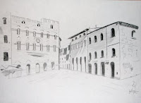
In the summer of 2005 I began my transition from taking classes in IT (Information Technology) to Computer Arts. I decided I didn’t want to know how to write software I wanted to learn how to creatively use software. My school has a fine arts foundation of two classes in drawing and then two classes in design. My regret from this semester is that I didn’t use better paper. The instructor was very loose about letting us use newsprint. I guess she thought is was cheaper and since it is a community college she assumed most people were on a strict budget. Near the end of the semester I transitioned to drawing paper. This is the best of bunch. It was drawn from a handout not real life. It is 18x25 and drawn in pencil on Bienfang paper.

Until my next post,
Diane

Saturday, January 3, 2009

A threefold win for UConn

If you are a fan of UConn (University of Connecticut) like me today was a great day. The football team won the International Bowl in Toronto, the women's basketball team beat LSU at their secondary home in Hartford and the men's basketball team beat Rutgers on campus at the Gampel Pavilion.

Until my next post,
Diane

Susan and Don

I mentioned in a previous post I had attended Art & Soul in Hampton, VA in 2006, 2007 and am scheduled again this year. Last year I had two classes with Susan from the same teacher, Albie Smith. I was having trouble coloring outside the lines so to speak, and Susan was my muse. I'd like to borrow the way Don (Susan's husband) did his intro to further introduce myself. Don has a great intro of how one thing in his life "naturally" led to another.

My lack of taking SAT's in high school led me to the local community college where I took a placement test for math and english. English no problem - math on the other hand not so good. Probably because I was in the "business" program in high school and hadn't taken algebra since 8th grade. I was placed in Math 101 a credit class but struggled. Late in the semester the instructor asked if I guessed at any of the questions on the placement test. I said yes. His reply "you are a good guesser, you don't belong in this class. He said what's your major. My dumbfounded look prompted him to ask "math/science or english/history". I replied english/history which resulted in his reply of I'll give you a "C" but get the rest of your math/science required classes in science. I did. I transfered to the 4 year state school without a goal (again) so I majored in History and Social Sciences. This soft science major "naturally" led to me joining the USAF and becoming a navigator. I stayed in for 22+ years which "naturally" led me to takes classes upon retirement in computer arts.

I guess the moral of the story is that sometimes you don't know where you will end up but keep putting one foot in front of the other. The other moral is that you don't need to know the value of X to become a navigator (and if I do say so myself a pretty good one).


This photo was taken a while back when I was at Desert Storm in Saudi Arabia. All the phones are hotlines to the units we had in the area. Sort of reminded me of the stories I heard about the old Russian phone system where they didn't have phones with extensions but MANY phones -- all direct lines. The more phones you had the more important you were. I guess we were important -- we had LOTS of phones. We controlled the air refueling (KC-135 and KC-10) in the area. Thus the acronym NKAWTG...N! (Translated -- nobody kicks a** without tanker gas...nobody!)

Until my next post,
Diane

Friday, January 2, 2009

Neat book artist

Jackie is a local book artist. I took a class from her just a little over a year ago in early Dec 07. I was surprised she didn't cancel the class since I was her only student. I'm glad she didn't since I got to learn two great techniques for making quick and neat mini books. We made a ribbon hinged book and a neat variation on a mini exploding star style book. I made three more of the mini exploding star books and gave them away to the gals I went to the UK with. (More about that later...). The ribbon hinged book is a signature book. While you are making the signatures you put ribbon in there and then cut a slit in the binding and tie it on the outside. I'm sure the pictures can give you a better idea than my words. The exploding star book would make a great graduation card since it looks like a mortarboard. In class we used card stock so it had color on both sides. I sort of forgot about that when I was making the ones for my friends. I then used some rubber stamps and direct to paper inking to make it double sided.


This is the ribbon hinged book.


I did the yellow and blue book in class and then made these next three at home for friends.


Until my next post,

Diane