Saturday, July 18, 2009

All Stamping ATC


This past week on the Altered Designs Yahoo Group we were encouraged to NOT use embellishments or collage images and Just Stamp. I did a simple layering technique using a stamp from Impression Obsession and colored it with Whisper Pastel watercolor markers.

Until my next post,

Diane

Thursday, July 16, 2009

Bottle Cap (faux) ATC


This month on the Stampers Corner Yahoo Group one of the ATC mingles was Bottle Cap. I didn't have any and asked if it was OK to use an image. I got an Adobe Illustrator file from their forum and changed it to my suiting. The base layer is paper from DCWV. The next layer was done using a Plaid stencil sprayed with watercolor. I used stamps from the Inque 262 collection on that layer and the tag. The faux bottle cap is on two layers of chipboard for dimension.
Until my next post,
Diane

Tuesday, July 14, 2009

Poster I created in Adobe Illustrator


Somewhere along the line I mentioned I had taken some classes towards a Computer Arts Degree. I'm not sure if I'll ever finish but I did get a basic foundation in drawing and design along with learning Adobe Photoshop and Illustrator. Last fall I took a class called Computerized Graphics where the end result was for print. We began with a review of Photoshop and then Illustrator and moved along to Adobe InDesign. This project was for an actual event at the school and the winning design (not mine) was used to publicize the event. Even though the films are digital in nature I chose to use a drawing that I made of a photo of an "old fashioned" film reel.

Until my next post,

Diane

Sunday, July 12, 2009

My Interpretation of Freud


My first InDesign project for the Computerized Graphics class last fall was to create a book cover for the now public domain book by Sigmund Freud "The Interpretation of Dreams". I took photos of clouds and a silhouette of me and recolorized them in Photoshop. Next I used Illustrator to do the drawings of the dreams. I got a book from the library and chose a few simple symbols to create. I also added the swirls to make it seem as though some dreams escape us. I also created the Balance Books logo in Illustrator. I got the photo of Freud from the web. The text of the book and the bar code were from the instructor. We used InDesign as the assembly point for the Illustrator and Photoshop stuff.

Until my next post,

Diane

Friday, July 10, 2009

1, 2, 3 Concept ATC


This ATC was for the TGIF mingle at the Altered Designs Yahoo Group. The theme was 1, 2, 3 Concept. You could interpret this more than the literal which I did. Some folks used 1 of one thing, 2 of another and 3 of a third thing. Like one butterfly, two clouds and three flowers. I had this stamp calling to me so I used it.

First I inked the Stampers Anonymous stamp on bond paper and cut out the 1, 2, and 3 using an X-acto knife. Now that I had a stencil I used Versa Mark on just those numbers and embossed with detail gold embossing powder. I inked the background with Ranger Distress Inks and then added a Tim Holtz game spinner and sprocket from Idea-ology.

Until my next post,
Diane

Wednesday, July 8, 2009

Ouch...this one is BRIGHT!!


I hope this one doesn't hurt your eyes too much. Don't change the settings on your monitor it hasn't gone crazy it's the ATC. This past week the theme at the Altered Designs Yahoo group was Bright Colors. I think I got a bit carried away but no one can accuse me of not meeting the requirements of the theme.
The stamped image is from Anitas and I colored it with Sakura Gelly Roll pens in Moonlight colors. The paper is from Marcella and the stickers are by Nicole.

Until my next post,

Diane

Monday, July 6, 2009

Over the pond Non Paper ATC swap


These three ATCs were the latest monthly swap I did with Sid "over the pond" in England.

This month it was my choice to pick the theme. I decided to go with an idea I wanted to do for a bit. The main surface can't be a paper based. If you need to use paper/cardstock as a support base that is OK but we were to decorate on a non paper surface.

The first one (in green) uses Claudine Hellmuth's sticky back canvas and her studio paints. I used regular stamps and stamped with the multi-medium and then used a series of greens mixed to get darker and darker as I made subsequent stamped impressions. She recommends using foam stamps for this technique but I had a bold image and I wanted it to be subtle. I think it works. The top two stamped images in black are by Stampers Anonymous designed by Tim Holtz.

The middle ATC was created by weaving the aluminum flashing tape you get at home improvement stores. After weaving the tape on chipboard to get some rigidity I used alcohol inks on the background. I cut and embossed some Cuttlebug images and also colored them with alcohol inks.

The last one is a a dried baby wipe (smells nice and fresh too!) that I inked with Ranger Distress inks. I tapped them to the craft sheet then spritzed it with water and colored the baby wipe. When it was dry I used another Stampers Anonymous/Tim Holtz image. The final touch was a shiny embellishment that I toned down by sanding a bit and coloring with Distress Stickles.

Until my next post,
Diane

Saturday, July 4, 2009

Happy 4th of July


I made two cards in honor of America's birthday. Both the same and just a bit different. The background paper was a different shade of white from the background that I stamped on so I needed to change something on one or both. On the one on the left I just used a bit of blue distress ink on the background paper. On the one on the left I used a bit of red and blue on both papers. The stamp is from the Hero collection by Artistic Outpost.

Until my next post,

Diane

Friday, July 3, 2009

Pre Independence Day ATC


The theme (naturally) for the Stampers Corner ATC of the month for July was "4th of July".

From the bottom up here's my layers. Blue cardstock, white cardstock, patterned paper from either Epson or HP. They both have some interesting patterned papers you can print. The top layer is a tag that I made using my big punch from McGill. All the stamps are the $1 kind by Studio G.

Until my next post,

Diane

Thursday, July 2, 2009

Jumping for Joy...well maybe not just yet, but progress!


Not sure what is going on but this post should have been posted on 2 July.

I had my second follow up appointment after my bunion surgery yesterday.


Good news:


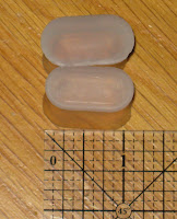
1) I don't have to wear these gel spacers between my toes. Before surgery my big toe was angled towards the next one. Putting the spacers in between the first two toes after surgery was training for the big toe to remain in the correct position. This greatly reduces the chance the bunion comes back. It was really annoying wearing these things so I'm really happy they are just a bad memory.

2) Goodbye Frankenstein boot, hello...whatever you call this thing. Of course they didn't have my size so I guess it is sort of a flipper. I think that's what I'll call it.

3) I can put weight on the entire right foot not just the heel.

4) Although I haven't tried yet I'm pretty sure I'll be able to drive. I never learned how to drive a standard transmission (we tried but hubby and I decided staying married was better than him yelling at me during the lessons) so I don't know how to drive with my left foot. I couldn't bend my right foot ankle so it just seems silly to attempt to do something that wasn't "really" necessary. I hope to have my freedom back.

Not as great news:

1) I still need the crutches until I get more comfortable walking with weight on both feet. My hands/wrists and the back of my arms are in a bit of discomfort (a.k.a. pain).

2) Now I have to shave both legs on a regular basis. I was getting quite used to shaving just one.

All in all a great day. Hope yours went just as well. Take time to enjoy the little pleasures in life.

Until my next post,
Diane